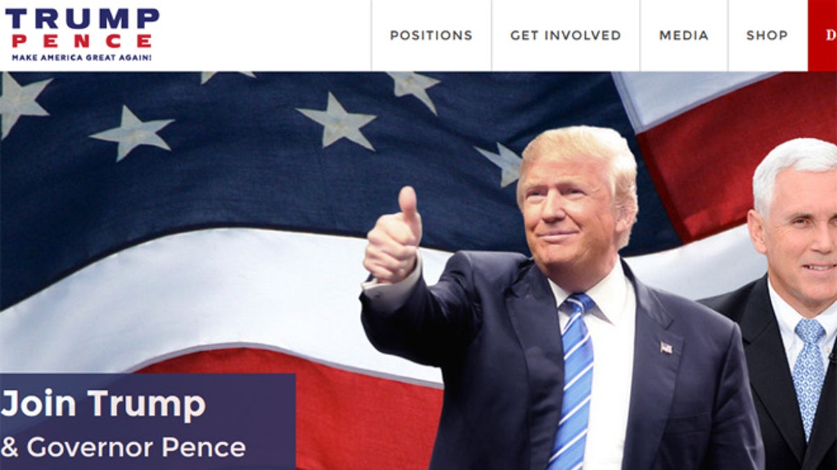
The Donald Trump campaign is again changing its logo, Fox News learned Saturday.
The campaign has already scrapped the one released Friday with running mate Mike Pence's name, presumably because the interlocking “TP” logo was criticized by reporters and on social media for appearing sexually suggestive.
Sources told Fox News that Trump, the presumptive Republican presidential nominee, personally approved the design from among several options. The decision to change the logo again was made Friday night.
The new logo -- Trump and Pence’s name over the signature campaign slogan “Make America Great Again” -- appeared Saturday on the official campaign website and on fundraising emails.
Several Trump aides say there may be a variety of logos out in the days ahead but not the "TP" logo.
Before the old logo was withdrawn, it was criticized not just by social media wags, but by professional designers.
"I think that it's very clear that Trump is the dominant partner in this relationship," designer Cyrus Highsmith told the Associated Press. "The only thing I can guess is that Trump wants to make sure that everyone knows that he's in charge. It's totally in line with his personality."
Nancy Skolos, dean of architecture and design at the Rhode Island School of Design, called the design "fussy and overwrought," and more like a "high school doodle."
Matt Luckhurst, of the Collins design firm in San Francisco, whose work includes Facebook's M app and Airbnb's rebranding campaign, said they did not think the image through.
"I think it's an oversight. I doubt they actually planned this," Luckhurst said. "It's something where they said good enough and they launched it out into the world."
Trump's is not the first campaign logo to become an online punchline. Jeb Bush's "Jeb!" logo was widely ridiculed.
While presumptive Democratic nominee Hillary Clinton's logo has been praised by many designers, it prompted intra-party grousing last year. It features an "H'' with an arrow pointing right, leading some Democrats to complain that the arrow did not point left.
Asked what a good logo should do, Skolos said it should be memorable. Highsmith said it should be recognizable quickly and not offensive, then hastened to add that he wasn't offended by the Trump logo.
"I think it's funny," he said. "Maybe that's another thing: Put it in enough focus groups to make sure you're not going to get laughed at."
The Associated Press contributed to this report.


