Apple
There’s a digital butterfly on my wrist that flaps its wings when I check the time. And just below it is the weather in New York City: 86 degrees and fair.
Apple released the latest operating system for its Watch last Tuesday, and the software update vastly improves the device. It’s an essential download for anyone who owns an original Apple Watch and would like it to work better. It offers a way for the device to feel new again, without a user having to buy the latest version of the timepiece, Series 2.
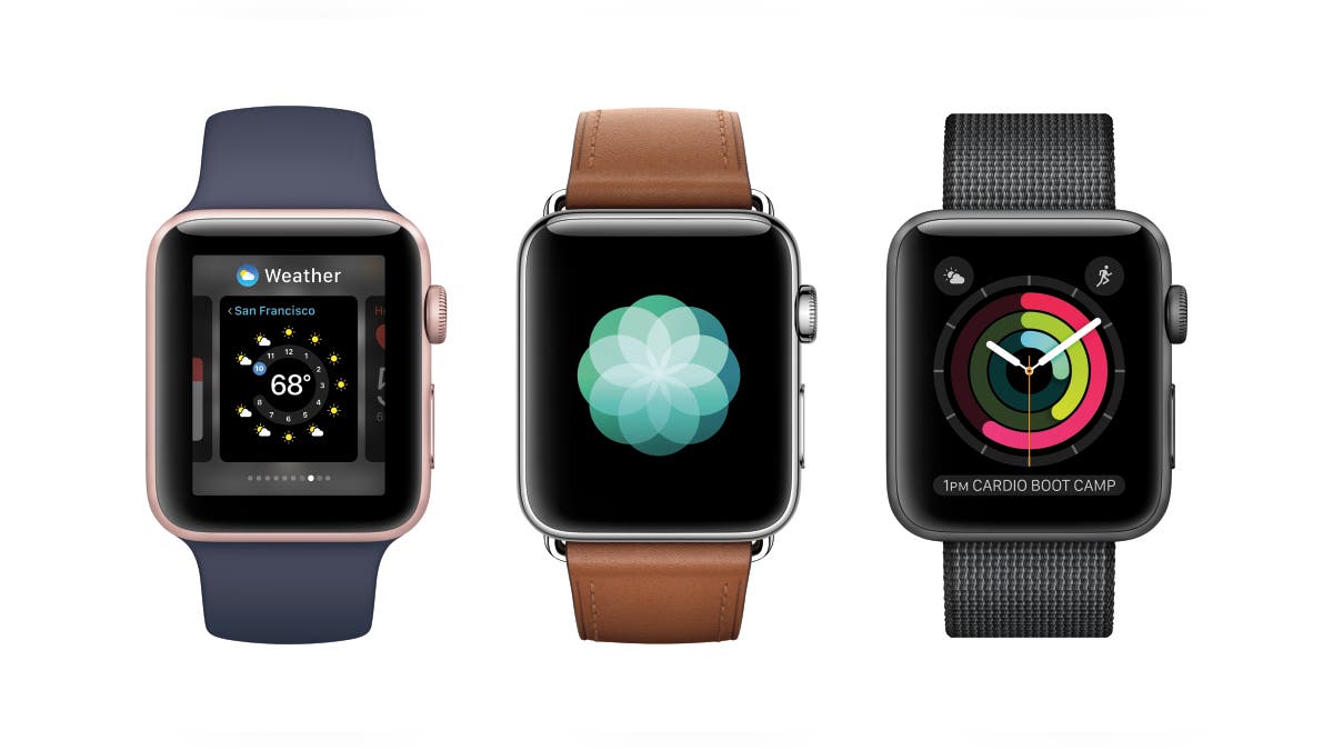
Called watchOS 3, the new operating system makes the Apple Watch more practical, mirrors the iPhone in some important ways— and has made me enjoy using the device, which I’ve owned since last summer, even more.
Part of the practicality comes from spots on some watch faces for new complications— those little tidbits of info that do things like show the phase of the moon or the charge of the battery. For example, that watch face with the butterfly on it (called “Motion”) now has space for more information, like the weather. (Before it showed only the time and date, as did the Timelapse and Photo faces.) There are also new shortcuts you can add to access your email and messages.
Another key change: pressing the side button shows a “dock” section with 10 apps in it, ready to be launched. For the Verge, Walt Mossberg compares the new dock feature to the home screen on the iPhone. The watch actually does have a real iPhone-like home screen, with lots of little round app icons, but that layer sits behind the watch face layer, and now only exists as a way to access all the apps that don’t sit in the “dock.” Maybe someday Apple will kill it.
Switching watch faces used to require a “force touch”-- a hard press on the screen— but they can now be switched with a full swipe to the left or right. That motion mimics the way iPhone users change their home screens by swiping the same general way. So, while the app dock on the watch is home-screen like, as Mossberg wrote, the watch faces themselves feel more like the watch’s real home base.
Related:
Swiping up from the bottom of the watch now reveals a control center, just like on the iPhone. That handy feature replaces what used to bring up a now-killed aspect of the watch called “glances.”
All of this— plus the speed improvement that comes with the new OS — makes me love using the watch. New colorful watch faces that focus on tracking your activity are a nice addition, as is an app called “Breathe” that offers a one-minute meditation-like experience. I used it on the subway recently, and even if I didn’t achieve nirvana, it was still relaxing. The watch tells you what your heartbeat is after you finish.
At the blog Daring Fireball, Apple-watcher John Gruber says the new operating system, as well as the new hardware, show that Apple realized what was wrong with the first-gen device and operating systems and worked hard to fix them.
“Original Apple Watch owners do not need to buy a new Series 2 watch to get a faster watch,” he wrote. “They just need to upgrade to WatchOS 3.”
Agreed.
Follow Rob Verger on Twitter: @robverger


