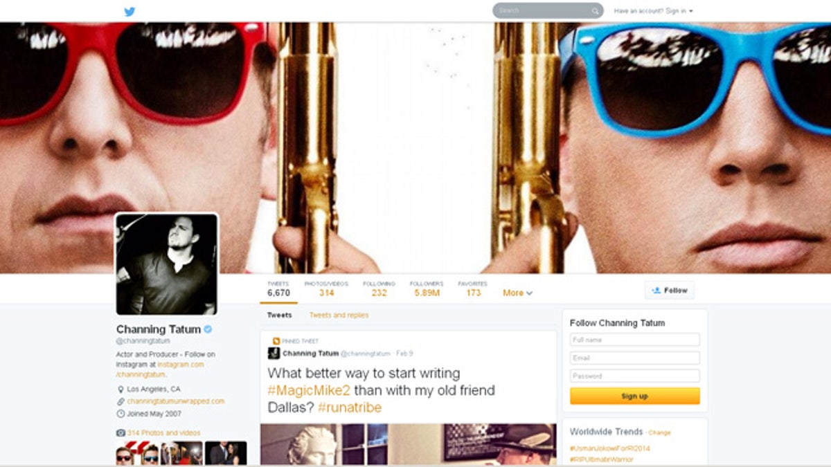
A screenshot of one of Twitter's redesigned profile pages. (Twitter)
The profile redesign for the Web version of Twitter is now available to all. The social media site unveiled the new look earlier this month, and in the intervening weeks has been rolling it out to select users of the service.
Evidently happy with the response, the microblogging site announced on Tuesday the revamped design is coming to all users in the coming days in a gradual roll out, though if you’re the impatient type and want to see it up and running for your feed right now, you can do so by heading here and hitting the Get it now button.
The new three-column layout makes more use of the screen space and comprises a new photo-centric design which’ll look familiar to Facebook and Google+ users.
New features include ‘best tweets’ where posts that have gotten the most engagement will show slightly larger, making it simpler for others to find your best content; ‘pinned tweet’ that allows you to pin one of your favorite tweets front and center for visitors to, as Twitter puts it, “see what you’re all about”; and ‘filtered tweets’ that lets you choose which timeline to look at when exploring the profiles of other Twitter users.
The profile image is now a little larger than before, while underneath you’ll see the month and year you joined revealed to one and all. There’s also a new, fresher look for the photos and videos section.
So, what do you make of the new look? A welcome revamp or a cluttered mess? Sound off in the comments below.


