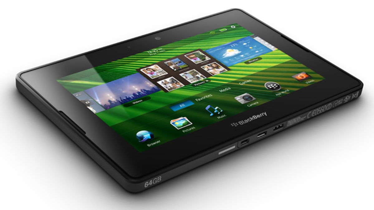
Research in Motion's new BlackBerry PlayBook, the company's entry into the burgeoning tablet computer market currently dominated by the Apple iPad. (RIM)
In consumer electronics, just like dating, first impressions make a world of difference: Blow the launch and you're in for a hard landing.
That's why the BlackBerry PlayBook has been getting such dim reviews -- if it's not love at first sight, there won't be a second glance from a consumer, especially with the handsome, capable Apple iPad out there.
Let's be clear, no one doubts that BlackBerry-maker Research in Motion can build a killer business tablet -- but for some reason the company hasn't.
I've been using the PlayBook for a few days now and found a laundry list of shortcomings: no email, no calendar, no contacts, no 3G cellular service, very few apps. The list goes on. Sure you can get some of these features if you pair it with your existing BlackBerry phone, but come on -- this stuff should be baked right in.
And if you don't have a BlackBerry you're going to be left feeling that this company doesn't want anything to do with you.
Opening the BlackBerry App World marketplace on the PlayBook takes you to a half-abandoned strip mall where the only stores left are a Dollar General and a Laundromat. Look, it's not the quantity of apps that matter, it's the quality. Apart from a paltry few dozen apps, the ones that made it into the store look like they were made over a long weekend.
RIM claims a whopping 3,000 apps have already been submitted. We'll see -- none are ready yet, though and we've no indication when they will be ready. And brace yourself: The PlayBook won't play any of the apps made available through the BlackBerry App Store.
That's right, the BlackBerry PlayBook App Store is completely independent from the BlackBerry App Store. Huh?
Consumers will demand a few quality core apps that simply don't exist yet, it seems. I wanted Pandora -- nope. I wanted a quality Twitter app -- nope. Quality games -- nope. I was able to find a 'How To Speak Swedish' app.
What frustrates me the most is that the user experience doesn't match the hardware. The PlayBook boasts a nice rubberized design, a beautiful screen, dual high-quality speakers on the front for stereo sound, and two nice cameras (one on the front one on the back). It's fast, powerful, and sturdy, but the experience is half-baked.
The operating system feels like a cross between Palm's Web OS and Apple's iOS, thanks to a sprinkling of features here and there like pinch-to-zoom, card stack, and the ability to hold your finger down on an icon to remove or rearrange an application.
The BlackBerry PlayBook has the nicest multitasking experience of any tablet, in its favor -- swipe up to show your available apps, left to right to see the apps you're running, or swipe down to see your tool bar. It just felt right, and I really enjoyed that.
You're not going to beat Apple by copying Apple, and initially I thought RIM might be the company to compete by creating something original. A business tablet for the Wall Street PowerPoint-loving crowd, perhaps? Not only does RIM's PlayBook fail to compete with Apple it fails to compete in the very niche it calls it's bread and butter: the business user.
Sure BlackBerry might fix these flaws over the next few months. But first impressions matter.


