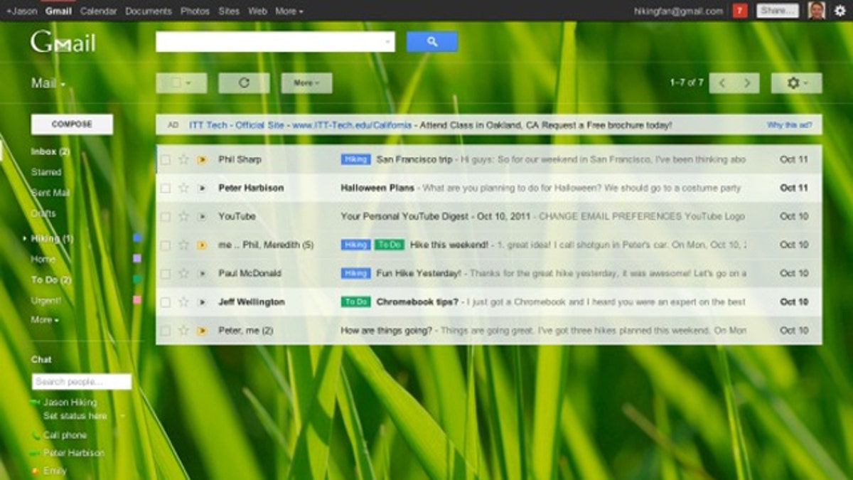
The new Gmail. (Google)
Gmail announced Nov. 1 it is rolling out a redesigned interface that users may preview as soon as they see the “Switch to the new look” on their Gmail homepage. Gmail designers have opted for Google’s trademark stripped-down interface along with new ways to customize the layout based on how an individual uses the free email service. The redesign is just that: you’ll have a new layout to learn, but no new features.
Ready to switch? Here are eight key changes that users will experience in the new Gmail. Familiarize yourself now, so that the switch won’t come as a shock.
1. Gmail automatically resizes itself to fit into any sized window. That means that when you adjust the size of a viewing window or use Gmail on different devices with different screen sizes, Gmail will adjust itself for a seamless experience from one display to another.
2. You can adjust display density settings. Choices range from “comfortable,” to show the minimum number of lines, to “cozy” and “compact.” This could be helpful when you change devices, such as reading email on a big-screen laptop, then switching to a smaller-screen tablet. The density control is found in the Settings menu located under the gear icon.
3. Adjust the size of the label and chat panes to suit your use. For instance, if you’re an organizer who uses labels for mail folders in addition to the standard Inbox, Starred and Sent, you can make that pane larger and hide Chat altogether. Alternately, chatterers can expand the size of their Chat list to show more contacts and fewer labels.
4. The labels themselves have more prominence in the new layout. They’re placed in the front of the subject line to make follow-up more efficient. Labels go beyond Google’s star system and can be created to group emails by topic or to indicate an action such as “To Do.”
5. Gmail has added new themes that include high-resolution imagery supplied by iStockphoto for HD displays. If you’ve been using a theme background, your old theme will be imported when your account is moved to the new design. Themes can be viewed under the Settings menu.
6. Conversation threads have been reorganized for improved readability. Instead of stacking emails in a thread making identification impossible until the user opens the stack, Gmail has redesigned conversations in a visible, horizontal format, which could be the most useful redesign element in the new Gmail.
7. Each email in a thread also displays the sender’s profile photo whenever available. This feature makes it quicker to identify different participants in a thread.
8. Gmail now boasts an all-in-one advanced search box. The box contains the same features as the old Gmail advanced search, but laid out in a vertical format that fits with the new design. Users can also create a mail filter within the advanced search box, eliminating the need to open an additional window.
Bottom line: Change always takes some getting used to. The redesign should be available to Gmailers over the next several days. How long that window of choice will remain is unknown, but at some point Google will flip the switch for stragglers. Better to turn on the new format sooner than later— you’ll have more time to adjust.
10 Laptop Gifts for Holiday 2011
Google TV 2.0 Coming: Should You Tune In?
Gmail iPhone App Coming Soon?
Copyright 2011 TechNewsDaily, a TechMediaNetwork company. All rights reserved. This material may not be published, broadcast, rewritten or redistributed.


