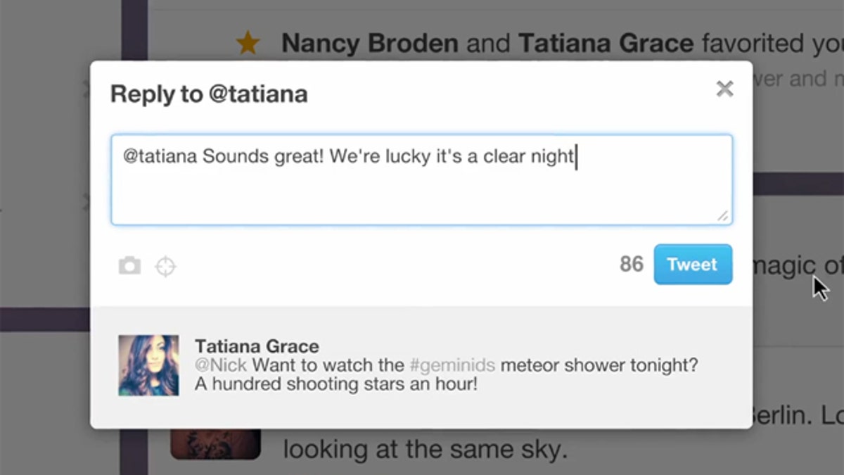
Twitter is looking to make its service more accessible to new users. (Twitter / YouTube)
Twitter launched a significant redesign of its micro-blogging service Thursday, Dec. 8, as the company looks to broaden its appeal -- simplifying its process for new users while providing a more robust platform for advertisers.
The new design puts ease of use front and center, an effort to bridge the gap between power users and inexperienced "newbies" more often than not unacquainted with Twitter’s protocol.
"Twitter should be usable for people who know the shortcuts and also equally usable for those who don't," said Jack Dorsey, one of Twitter’s three co-founders and current chairman.
"It's not just a visual redesign but a conceptual redesign to make Twitter more accessible to the next billion users," said Satya Patel, a Twitter senior executive, at an event inside the company's future headquarters in an Art Deco building in a blighted, San Francisco neighborhood.
The revamped home page is now topped with three icons: Home, “@Connect,” and “#Discover.” Twitter seeks to rebrand the two most commonly used site functions -- the at sign (@) and the hashtag (#) -- making big strides in reducing the learning curve.
On the Home page, the overall feed is much more user-friendly and Facebook-like than before. Photos and videos show up within tweets and all information is presented in an easy-to-understand format.
@Connect designates conversations. Clicking on it takes users to a page that visualizes their Twitter interactions, showing them how many times they’ve been retweeted or if they’ve been mentioned by other users.
In #Discover, users will find the more dramatic change.
One of the biggest issues for many new users is the lack of initial content when they first sign up for the service. Being a new Twitter user can be a lonely experience. Without a prepared list of friends or other sources to follow, fresh faces are often introduced to a blank timeline, a list of potentially esoteric trending topics, and a measly search bar.
"It's the first step to start to surface all the rich content that's pouring into the platform for people who are experiencing it for the first time," Twitter CEO Dick Costolo said.
The #Discover tab goes a long way in addressing this, packaging the noise in a meaningful way and giving users a portal to find content from the get-go, providing trending stories, community activities, top categories, and suggestions for who to follow and connect with, in a way that feels somewhat familiar to Facebook. All of this information is tailored toward your interests, location, and other information Twitter gathers to better curate your experience.
The other major development are brand pages to create -- in the company’s words -- “an even more compelling destination on Twitter for their brands," as it sets its sights on long term monetization of the service.
All of these changes should help provide a big boost for the service, which from an evolutionary perspective, was starting to feel a bit stale -- especially with Facebook’s Timeline feature looming on the horizon.
Of course, as with all major overhauls, the reaction has been polarizing, with much of the hate coming from so-called “power users”. Reviews of the app on Google’s Android Market and Apple’s App Store have been decidedly mixed. One user, Stefan Constantine, rated the new app one star, warning people not to upgrade. “There are many reasons why I simply can’t recommend this,” he complained. Another user called it “too simplistic.”
On the Apple App Store, the new version of Twitter is currently rated 2.5 stars with 829 ratings while all versions have an aggregate rating of 3.5 stars with 150,902 ratings.
For Twitter, this may be a necessary compromise as it looks to reinvent itself.
“We will offer simplicity in a world of complexity,” said Dick Costolo, the company’s chief executive.


