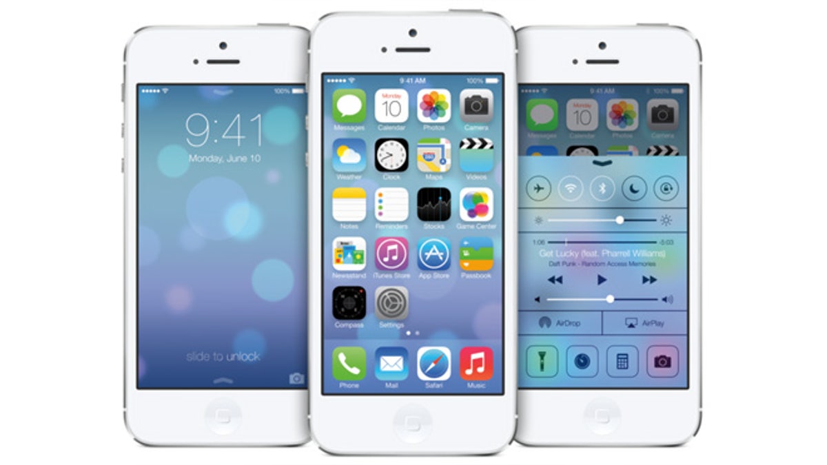
Apple unveiled the biggest change to iOS since the launch of the first iPhone in 2007 at the Worldwide Developers Conference on Monday. (Apple)
Tech experts blasted Apple for the biggest change to iOS since the launch of the first iPhone in 2007, calling it “childlike” and “shockingly basic."
"[The design of the icons were] the first sign that there are points of confusion and even missteps in Apple's new approach," wrote Joshua Topolsky, the editor-in-chief of The Verge. Criticizing that the new design as “childlike” and “shockingly basic,” he cited lack of "continuity" between the home screen, apps and other menus as another problem.
Other tech pundits had similar criticisms.
“While the operating system boasts an impressive redesign, many features and UI choices were greatly inspired by innovative third-party apps or even competitive mobile operating systems,” explained Romain Dillet, a writer for TechCrunch.
Striving for a clean, simplistic look for its newly unveiled iOS 7, the company threw out the traditional skeumorphic look – apps that retain the design elements of physical objects – that has seeped through all aspects of Apple’s user interface for both iOS and OSX.
In other words, that yellow legal pad design that you usually see in the Notes app? Gone.
Featuring a flat design that Apple CEO Tim Cook called "a stunning new user interface," iOS 7 has a multilayered look, with translucent panels.
Jony Ive, the designer behind the mobile operating system’s new look, took over in late 2012, after Scott Forstal left the company. Forstal – and former CEO Steve Jobs – had been the driving force behind the current skeumorphic look of iOS.
Some thought that the design was just the thing to revitalize the tech company. Shortly after the WWDC, Bob Lefsetz, a music industry critic and consultant, wrote that the “positively mind-blowing experience was iOS7.” BGR writer Zach Epstein agreed, writing that “iOS 7 made Apple exciting again.”
Other critics didn't think so highly of the redesign, often saying that it was confusing and contained features that were much like some of Apple’s competitors.
Another BGR writer, Jonathan Geller, wrote that the design, at first glance, appears to be “a bit too simple. A little childish. Maybe even too basic.” But after exploring it, Geller states that iOS 7 is innovative and bold.
Phill Ryu, a longtime Apple supporter and iOS designer told The Wall Street Journal that while he likes the new direction, he feels Apple's "online services are lagging more and more behind the state of the art by Google. I'm not sure Apple can continue making up for that by continuing to squeeze out more gains from design."
Ryu tweeted about how the new unlock screen – which now features a down arrow, but still requires the user to swipe from left to right – might cause some frustrations with long-time iPhone users.
iOS 7 is scheduled to be released in the fall and will be available for iPhone 4 and over, iPad 2 and over, the iPad mini and the iPod touch fifth generation.


