Bringing start-up mentality to selling wine
Uproot Wine is using technology to develop direct wine sales that focuses on the consumer experience.
Much to the dismay of the old-time Petrus lovers, the wine world is moving forwarding and incorporating technology.
For instance, we’ve talked before about how Napa Valley’s St. Supery has started doing online tastings. And Bottlenotes CEO Alyssa Rapp was in town to suggest some apps that bridge old world winemakers and younger drinkers.
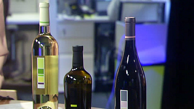
In the interest of continuing to help those younger drinkers, someone has finally made the wine label more user-friendly. Uproot Wines, has created a first-of-its-kind color infographic bar, which goes right on their label, that lets drinkers visual identify what's in the bottle. The color refers to the actual taste and the size of the color block strip refers to how much of each flavor you get in the wine. So, as an example, a big light green box means the wine will have lots of melon flavor in it. Or a small light purple block means you’ll get a touch of passion fruit in each sip.
The label was the brainchild of Jay Levy, a venture capitalist at Zelkova, and Greg Scheinfeld, formerly a finance guy on Wall Street.
Levy, as a partner in Zelkova Ventures and the founder of Uproot, is taking advantage of the companies in its portfolio. Many of them have provided ideas and assets to Uproot which is helping them technologically shape the business, says Levy.
Uproot wines currently offers a 2011 Sauvignon Blanc, 2011 Gray Edition Sauvignon Blanc and a 2012 Grenache Blanc. Within the next six weeks, they will offer 2011 Cabernet and a 2012 Grenache.
So check out a bottle and let me know if the label helps you.
Cent’ Anni.


