Fox News Flash top headlines for January 7
Fox News Flash top headlines are here. Check out what's clicking on Foxnews.com.
New look, same king.
Everyone knows what to expect when they order some Burger King. Going forward, however, fans of the franchise are going to have to get used to a new look.
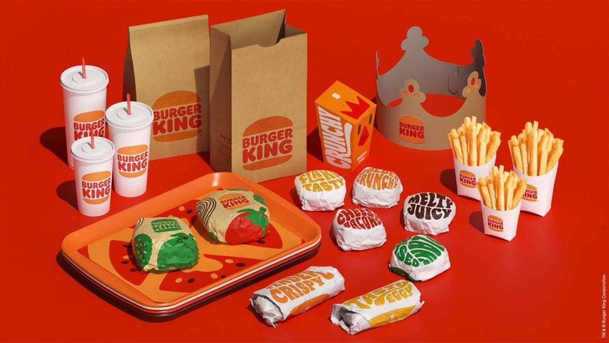
Burger King recently unveiled a new logo which was inspired by the brand’s classic design, according to Restaurant Business Online. The franchise also announced that it will be issuing new uniforms, a new color scheme and other changes.
"From '65 to '98 we had a strong, iconic identity," Raphael Abreu, head of design for Burger King parent Restaurant Brands International, told the news outlet. "It was a true classic. We thought back at that time we looked our best. We thought that was the best representation of the brand."
According to Abreu, the chain’s latest logo is meant to look more like a burger, signaling the brand’s focus on its food. He explained that the previous logo, which was more stylized, appeared to show that the restaurant was focused on speed of service.

Burger King recently unveiled a new logo which was inspired by the brand’s classic design. (Burger King)
FOLLOW US ON FACEBOOK FOR MORE FOX LIFESTYLE NEWS
He continued, "The simplicity of the logo — fewer shapes, fewer colors — definitely looks better on the screen if you reduce the size of it. It definitely reads much better than the previous identity."
CLICK HERE TO GET THE FOX NEWS APP
The new branding will reportedly take several years to work its way fully through Burger King and its locations across the country. The redesign will be implemented on the company’s website first, but it will take time for restaurants to work through their existing supplies of food packaging before using the new designs.
A representative for Burger King confirmed to Fox News that the new designs would begin rolling out on Jan. 7.

